Can I Create a Pie Chart in Canva?

What is a Pie Chart?
A pie chart is a visual representation of data that is divided into segments, resembling slices of a pie. Each segment represents a specific category or data point, and the size of each segment corresponds to the proportion or percentage it holds within the whole.
Can I Create a Pie Chart in Canva?
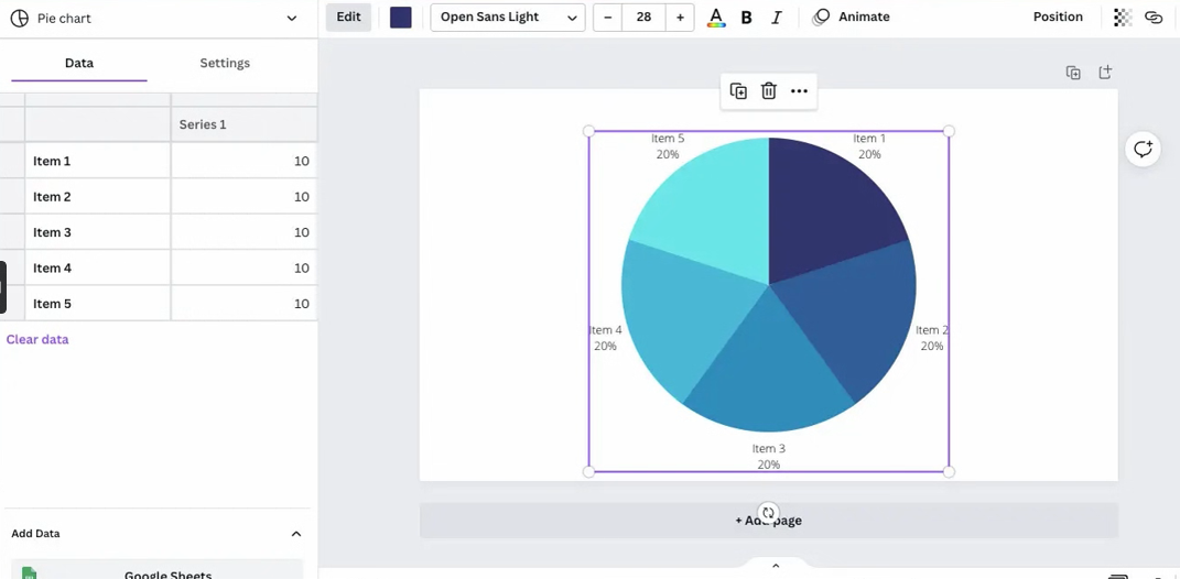
Yes, you certainly can create a pie chart in Canva. Canva offers a wide range of tools and features to help users create visually appealing graphics, and pie charts are no exception.
To create a pie chart in Canva:
- Start a new project or open an existing one.
- On the right side panel, you'll find the 'Elements' tab. Click on it.
- In the search bar within the 'Elements' tab, type "pie chart" and hit Enter.
- Select a suitable pie chart template from the search results and drag it onto your project editor.
- Once the pie chart is added to your editor, you can customize it further.
- Click on each segment of the pie chart to add custom values and data points. You can adjust the labels, colors, and percentages according to your data.
- Don't forget to add a title and any necessary labels to make your pie chart easy to understand.
Customizing the pie chart allows you to present your data effectively. Whether you're visualizing sales distribution, survey responses, or any other data that can be represented in percentages, Canva's user-friendly interface makes the process straightforward.

Conclusion
Creating a pie chart in Canva is a simple and intuitive process. Thanks to the 'Elements' tab, you can easily search for and add a pie chart template to your project.
Once added, you have the freedom to input your own data values and percentages for each segment. This customization ensures that your pie chart accurately reflects your data and is visually engaging.
